

Growth Case Study #7: Oyster
I study landing pages and onboarding flows of top products to get 1% better at growth and marketing, 1 post at a time.

A quick note before we start: I’m back after a month-long break. I went on vacation and experienced several personal changes in the past few weeks, but now I’m back. This time, I’ll be writing about companies that recently raised funding and analyzing what makes their websites and onboarding processes so successful.
No startups have experienced more dramatic growth and subsequent pullbacks in recent years than remote HR companies. Oyster HR is one such company that went through a wild roller-coaster ride in 2021 and 2022. They competed with the likes of Deel, Remote, and a few others that act as Employers of Record, making it easier for companies to hire, pay, and provide benefits to their employees and contractors.
They raised funds last month at a slightly higher valuation of $1.2B compared to their last one, which came during the peak of startup valuations. This is a good sign that they have weathered the tech startup value crash, RTO policies, and managed to grow during these difficult times.
Home Page
Here’s their home page structure:
Navigation
Hero
Tagline
Unique CTAs
Product Visual
Social Proof #1
Promotional Offer
Product Features
Social Proof #2
Differentiation
Integration
How Does It Work?
Resources
Navigation

Their nav bar is very simple:
products → features
solutions → use cases
why oysters → differentiation
resources → for existing users
pricing
They present two CTAs, with an emphasis on “Book a Demo,” which makes sense. Paying remote employees and managing immigration is a complex topic—it’s easier to watch a demo and connect with a real person.
Hero
My first impression of the above-the-fold section is that there are so many elements. It's hard to figure out where to focus. There’s a promotion at the top and bottom, a tagline, product visuals, G2 reviews, and company logos.
This seems to be a deliberate decision. I checked the Wayback Machine and noticed that their past landing pages look very different. If you're curious, check out these pages:
Early 2023 - wow the difference is night and day! So much cleaner.
Early 2022 - even cleaner and more bare bone.
Mid 2020 - this is about 4 months after they are founded.
This caught my interest, and I'm thinking about writing a post comparing a website over time, discussing the differences by section—interested? Reply to let me know!
Tagline
Let’s look at the tagline first.
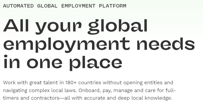
Automated global employment platform → what oyster is
All your global employment needs in one place → use case it solves
Work with great talent in 180+ countries without opening entities and navigating complex local laws. Onboard, pay, manage and care for full-timers and contractors—all with accurate and deep local knowledge. → what pain is removed and how
This is unique, as we typically see just two taglines. The logic here, as I see it, is:
Here’s who Oyster is, but
Specifically, here are the use cases we solve, and
Here are the problems we can remove and how we do it (and why you should trust us)
Unique CTA

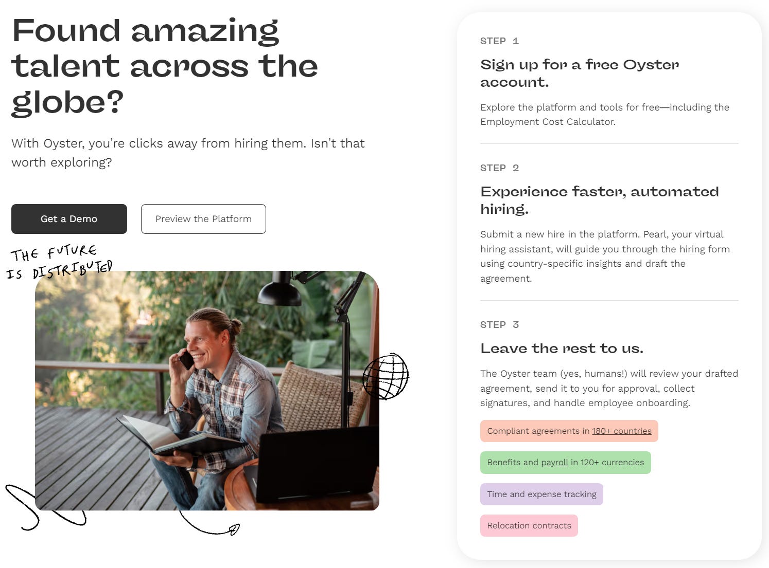
I want to highlight one of their CTAs here - "Preview the Platform." It offers a glimpse of the platform without requiring sign-up or even an email. I'll showcase more of this in our onboarding section later.
Product Visuals

It's interesting that they represented their persona alongside three product visuals:
Payroll → handling the most common use case
Global compensation calculator → deciding the local pay band
Virtual hiring assistant → AI
Social Proof #1


Immediately (and only on desktop), they display their G2 reviews and showcase companies using their product.
Promotional Offer


This is a rare element—a scrolling three-month free offer. Along with the company logo scrolling, it's also adding to what makes the page feel pretty busy. But once again, there must be a reason for this, and it probably works to some degree. My guess is their customer is really price-conscious, so they make their offer stand out more.
Product Features
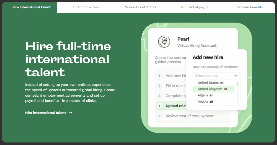
This section is a great showcase of both their product features as well as the geographic locations they serve. The latter is vital to show.
The product features section go into details to explain how each feature works under these three main categories:
hiring
paying
benefits
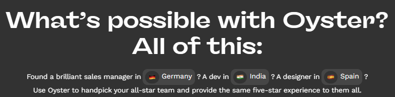
Social Proof #1
What's interesting here is how their visual style changes slightly. Did you notice the chalk art? It feels quite different from the SaaS-y feel above the fold.
Once again, as we discovered before, social proof works best when it's detailed, and they provide a lot:
Profile picture → yes, they should be smiling
Name
Title
Company
Persona (leadership vs HR vs Finance)
Verbatim with keywords bolded
Oh, did you catch the two CTAs here? A great spot for them—"Other great leaders chose Oyster, why not you?"
Differentiation

Because Oyster operates in a highly competitive market, they need to differentiate themselves clearly. Rather than focusing just on features, they emphasize important distinctions such as:
compliance and legal expertise
local intelligence
streamlined workflows
I also appreciate the video as it provides an opportunity for those interested to explore these topics in depth, while the four tiles offer concise summaries.
Integration

This section emphasizes how easy it is for organizations using third-party apps to get started. The more complex an organization’s HR infrastructure is, the more valuable this information becomes.
How Does It Work?
This section is essential for selling a product to teams unfamiliar with the subject. Teams need clear expectations before getting started, especially when they lack expertise. Oyster, for instance, is chosen because it simplifies international hiring for non-experts.
They embed the two CTAs here again, aiming to close the deal and convert after addressing a major concern or objection.
Resources

This is a rare section where companies showcase their thought leadership. If someone has scrolled down this far, it's likely they aren't ready to try Oyster yet.
The content above helps either close the deal, or build trust so they return later.
Onboarding
First, I want to showcase their preview page here. It acts as a bridge between the website and the app, but closer to a marketing site.

It’s not very interactive (the only interactive element is “Calculate Cost”), but it provides a good preview of what the portal looks like. You’ll notice later that this page doesn’t resemble the app. Instead, it focuses on delivering information like hiring guides, FAQs, and showcasing integrations. This is why I mentioned it feels more like a marketing website.
I’d love to see what the “hire,” “pay,” and “total rewards” sections look like, but instead, it just takes you to the sign-up flow.
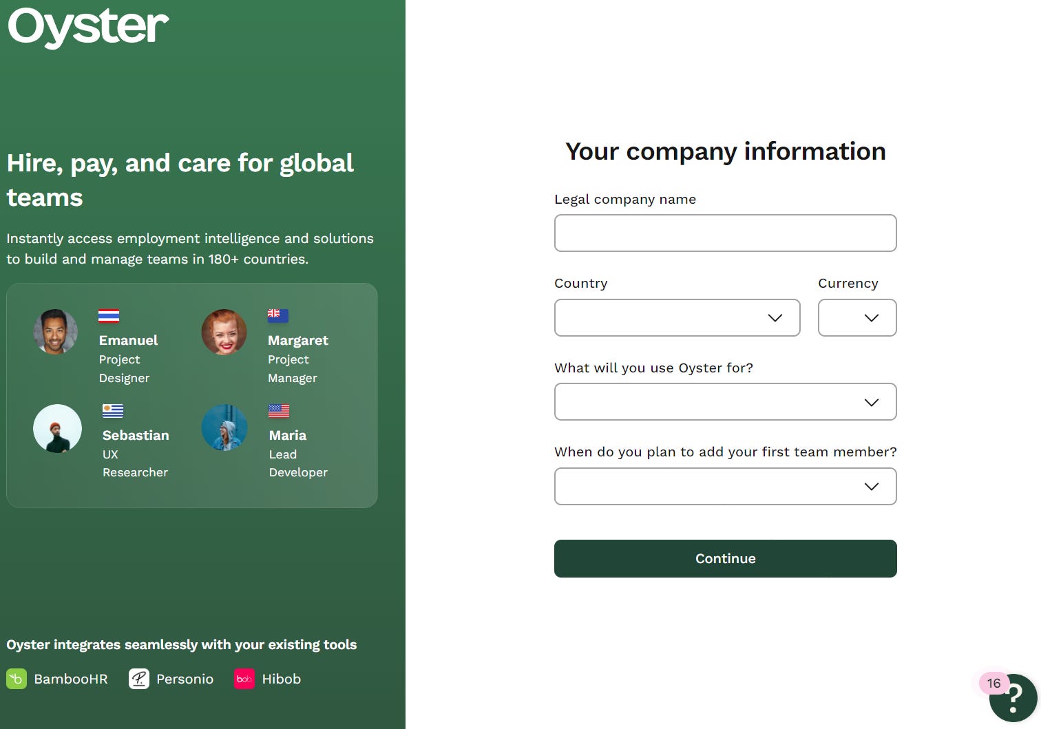
Sign-up Page

It’s a very typical two-column design. On the left, there’s another tagline: "hire, pay, and care for global teams," which aligns with their three main categories. They hinted at the talent users could access by displaying country flags, titles, names, and profile pictures. They also emphasized integrations.
These elements aim to
showcase the capabilities like integrations (if the user missed/skipped them),
paint the dream (what they could achieve → talents with profile pictures)
What’s interesting is that they don’t allow non-business email accounts to sign up, which makes a lot of sense.
Completing Profile
This is basic leader qualification - and I’m sure they have campaigns set up to activate different personas here.
App Interface
The first page after completing your profile looks similar to the app preview page but features different content. This app page includes a checklist that guides users through the remaining onboarding steps.
For instance, "verify email" is already checked off to give users a sense of achievement as they get started. In fact, all users viewing this page should have already completed that step.
Checklist
Completing Mandatory Information
The first item on the checklist is completing mandatory information and takes you to the page below.

Unfortunately, the information that you are expected to complete all the way at the bottom, hidden.

This is a missing opportunity - adding a quick link to the bottom can easily solve this issue.
Add a Contact
Clicking add a contact takes you to the page below.
Once again, I’m not sure why I should add a contact nor do I know which section I should add the contact to. Remember, don’t make your user think.
Payment
This part is fairly straightforward and makes sense to connect.
Calculate Hiring Cost
This piece is fairly interesting because it is also one of the CTAs on the main app screen.

I believe this is the most important tool for getting people to that “aha” moment. After trying it out, I was genuinely impressed by how easy it is to compare talent hiring across the world.

On this page, users can easily purchase the service and hire immediately, or sign up for a free trial to learn more about compensation for different roles. It adds a lot of value to the user’s experience, building trust along the way.
What would be awesome is if you could tell Oyster what roles you’re planning to hire for, and it would provide a quick comparison of recommended countries based on factors you care about, such as:
Cost
Candidate pool size
Candidate quality
I’d argue that this tool should be the first thing on the checklist!
Key Learnings:
There’s no one-size-fits-all best practice for landing pages. Oyster, for example, shifted from a clean, modern design to a more information-dense landing page.
Choosing elements for a landing page largely depends on what resonates with your buyers or users. Oyster clearly understands that offering "3 months free" is a compelling incentive.
Effective social proof requires attention to detail—minor yet crucial elements that can make a big difference.
In competitive spaces, a differentiation section is essential to stand out.
Integrations are key when your product is part of a larger workflow.
A “how it works” section is especially helpful for products that buyers or end users may not be familiar with.
Onboarding is much more effective when users don’t have to think too much.
The goal of onboarding is to demonstrate the value of your tool immediately. A checklist is most effective when it prioritizes the steps that will get users to that “aha” moment first!